Essential Tools and Materials for Thatch Artistry
Choosing the Right Pencils and Graphite
Pencil choice defines the texture of every thatch roof drawing. Without the right graphite, your strokes will either flatten or over-darken. I rely on a sliding scale. An HB pencil handles initial layout. A 2B gives midrange shade. For the deepest crevices between thatch bundles, a 4B works well.
Keep a mechanical pencil with a 0.5 mm lead for crisp, fine lines on the sharp edges of individual reeds. A kneaded eraser brings back light areas; that is vital for sunlit thatch. To avoid smudging, work from top to bottom.
A basic setup for thatch roof drawing includes these grades:
- 2H for light base strokes
- HB for structural lines
- 2B to 4B for shadows and texture
Graphite quality matters. Cheaper pencils contain scratchy particles that tear the paper. Invest in artist-grade brands. The difference shows in your thatch roof drawing!
Advanced Erasing Techniques for Fine Lines
Static cling in a thatch roof drawing is the enemy of every artist who has ever blown a masterpiece across the room. No amount of graphite selection will save you from that catastrophe. Instead, you need a precise arsenal of erasers. The kneaded eraser is your scalpel. The battery powered eraser is your jackhammer. Use both or risk creating a muddy mess.
When you need to lift fine strands of light from deep shadow, use a battery operated eraser with a vinyl tip. It cuts clean lines. For larger corrections, a standard putty eraser works best. However, rolling it into a sharp point is the real trick. Press and pull, never rub.
– Kneaded eraser for tonal lifts and soft edges.
– Battery eraser for precise, fine line removal.
– Vinyl eraser for complete elimination of dark strokes.
– Stencil shield to protect surrounding thatch from accidental smudges.
The shield is a metal sheet with cutouts. It is your best friend. Place it over areas you want to preserve. Then erase confidently. Also, use a light box. Place your paper over it and view the underlying sketch. You can identify areas where the thatch density is wrong. Rubbing with a dry brush afterward removes dust and reveals the final result. Every tool serves a purpose, and they all save your sanity.
Rulers, Curves, and French Templates
A thatch roof drawing succeeds when your lines follow the the roof’s natural contours. A steel ruler establishes long, straight edges for the base. A French curve guides the sweeping arcs of overlapping grass. For the irregular dips of a weathered roof, a flexible curve bends to your reference photo. French templates offer repeatable shapes for common thatch patterns.
Your material choices affect consistency. A clear acrylic ruler reveals the graphite beneath, preventing misalignment. A hard plastic French curve does not snag the paper. Combine these tools with a steady hand to produce an accurate thatch roof drawing.
- Steel ruler for straight edges
- French curve for organic arcs
- Flexible curve for custom contours
- French templates for standard motifs
Digital Styluses and Drawing Apps
In South Africa, thatch roof drawing has moved beyond the sketchbook. A digital stylus with tilt response and pressure sensitivity lets you replicate the layered grain of dried grass. Apps like Procreate and Adobe Fresco offer custom brush engines that simulate the natural shuffle of thatch strands.
I prefer a stylus with a fine point for thatch roof drawing. A matte screen protector adds friction, mimicking paper. Palm rejection keeps your hand relaxed while you trace the roof’s undulating edges.
- Stylus with palm rejection
- Matte screen protector
- App with custom texture brushes
These basics support a precise thatch roof drawing, without losing the tactile feel of traditional media.
Ink and Pen Variations for Texture
Ink brings a different discipline to thatch roof drawing. The inability to erase forces deliberate strokes, but the payoff is a crispness that graphite cannot match! A dip pen with a flexible nib produces line width variation that follows the natural taper of thatch strands. I keep a crowquill pen for the finest details, where individual grass blades meet the shadow line.
For broader textures, a dry brush loaded with diluted ink creates a stippled effect across the roof plane. It captures the weathered look of Cape thatch after winter rains. Pigment liners in graduated sizes offer consistency for repetitive strand work.
Consider these ink tools:
- Flexible nib dip pens for expressive line width
- Crowquill pens for delicate blade tips
- Dry brush for weathered texture patches
- Pigment liners for uniform strand repetition
Each tool leaves a distinct mark on the thatch roof drawing, altering how light and shadow settle across the surface.
Understanding Roof Structures and Perspective
Basic Roof Shapes and Ramps
Roof structures dictate the entire silhouette of a thatch roof drawing. Before placing a single stroke, study how the rafters, purlins, and the thick thatch layer interact. This underlying framework determines the pitch, the overhang, and where shadows will pool.
Perspective alters every line you draw. A roof seen from ground level behaves differently than one viewed from an elevated angle. The thatch’s natural flow follows the structure beneath it, so your lines must bend accordingly.
When assessing a structure for a drawing, observe:
– The rake angle at the gable ends
– The thickness of the eave edge
– How thatch courses overlap near the ridge
– The way shadows compress under deep overhangs
These structural cues tell you how to layer your strokes, turning a flat facade into a believable thatch roof drawing.
Slope Angles and Thatch Layering
A thatch roof drawing succeeds or fails on the confidence of its structural lines. The slope angle is your first decision, as it dictates how the entire silhouette reads to the eye. A steep pitch demands tighter, more vertical strokes while a gentler incline allows for a longer, more horizontal flow of texture.
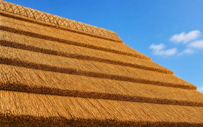
Each layer of thatch acts as a separate volume of mass. You must observe how the eaves compress under their own weight and how the ridge line builds up over the courses below. The magic happens in the staggering of these layers, which creates the depth that makes a roof feel alive.
When you begin to render a thatch roof drawing, follow this sequence:
1. Map the primary ridge line and the eave shadows.
2. Sketch the major overlapping courses of thatch.
3. Add individual strokes that break the uniformity of each layer.
This approach respects the physics of the material, giving your drawing a tautness that flat rendering cannot achieve. The visual weight should always sit heavy on the lower courses, grounding the roof to the walls it shelters.
Overhangs and Eave Projections
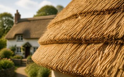
A thatch roof drawing often hides its failures in the shadow of the eave. The overhang is a social gesture as much as a structural one. In South African homesteads, thatch eaves jut out with a particular pride, announcing the household’s sense of shelter.
Perspective distorts these projections mercilessly. When viewing a roof from below, the eave appears to compress. The bundle’s thickness widens, while its height diminishes. To keep your drawing honest, observe the eave’s relation to the wall plane.
- Measure the overhang’s depth against the building’s width.
- Note how the corner dips under its own weight.
- Check the shadow line’s angle against the sun.
South African thatch, especially on older Cape homes, carries a proud eave. It does not simply stick out; it presents itself. Your perspective must respect that posture.
Deepening Depth via Light and Shade
To look at a thatch roof with honesty, you must see the frame inside the outer layer. Rafters and purlins carry the load, and their geometry stays visible after the thatch settles. The ridge line sets the top, and the eave sets the reach. Understand the structure before you render it, and your thatch roof drawing will gain substance long before you touch the straw.
Light and shade deepen that substance. The South African sun cuts sharply across the bundles, throwing long shadows into every furrow. I draw the shadows as much as the straw itself. When the shade at the eave’s foot dips, the roof gains weight. The sun’s angle reveals the curve in each clump. In your thatch roof drawing, brightness pushes the material forward, darkness pulls it back, and the whole structure sits solid!
Proportioning and Scale in Architectural Sketching
Every drawing begins with a single question: where do the timbers hold? A thatch roof drawing only works when the frame beneath the reeds has a clear geometry. The rafters and purlins make the ridge line drop and the eave hold its distance. I sketch those first; the straw then belongs to a true shape.
Perspective proportion and scale follow the same path. The roof is measured against the door line, the windows, and the stoep under the overhang. I check three ratios at the start:
- the height of the wall under the ridge;
- the eave’s outward reach compared with the roof pitch;
- the space between the gable edge and the ridge line.
The viewpoint controls the angle, not the hand. Walk to the side, settle, close one eye, and let the shape rise. Once those ratios hold, the thatch roof drawing stays convincing under its own shading.
Step-by-Step Drawing Approaches
Building the Underlying Frame of a Roof
Just as a thatcher in the Karoo will tell you that a roof is only as sound as its timber skeleton, so too does your drawing begin beneath the surface. The underlying frame dictates the silhouette of the entire structure, and ignoring it leads to a thatch roof drawing that feels structurally dishonest. You are not merely sketching a texture; you are documenting a framework of load and support. Start by establishing the primary rafters, which carry the weight, and follow them toward the ridge beam.
Before you lay down a single stroke of graphite for the thatch, map out the precise geometry. The frame is your architectural truth.
– Plot the main rafters, ensuring they meet the ridge at a consistent angle.
– Connect these with horizontal purlins to define the depth of the roof plane.
– Add the eave battens to establish the overhang projection you have already practiced.
This layout provides the scaffolding for your shading later. Once this geometry is on the page, you can render the thatch as a secondary layer that clings to this internal logic. Without this initial structure, the organic, fluffy nature of the thatch will overwhelm the drawing, turning a detailed sketch into a shapeless mound. Keep the linework for the frame light but decisive, as these are the bones that will support the visual weight of the finished roof.
Sketching Thatch Stalks and Layer Flow
Thatch is not a single material. It is thousands of individual stalks, each one a line. Most artists try to draw the mass first. That is a mistake. You must draw the flow of the layers before you ever attempt the texture. Watch how the rain runs off the roof. The thatch will follow that same path. This is the energy you are capturing.
Start with the base course at the eave. This is your anchor. The stalks here are the most visible and the most defined. Draw them with deliberate, downward strokes. They are not perfectly straight. They bend slightly, they twist, they interrupt each other. Do not clean them up. The character lives in the irregularity.
– Work from the eave upward.
– Follow the rake edge for the cleanest lines.
– Let each subsequent course overlap the one below it.
– Vary the pressure on your pencil to break up the uniformity.
As you move toward the ridge, the layers compress. The individual stalks become less distinct and the shadows take over. Here, your lines should become shorter and more densely packed. The top courses are pushed against the ridge pin, which creates a tight, folded look. This is where the flow stops and the weight of the roof settles. The eye moves from the loose, hanging lines at the bottom to the compressed, dense strokes at the top. That contrast is the entire drawing. That is the rhythm of a true thatch roof drawing.
Applying Varied Line Weights for Realism
Line weight is the difference between a flat sketch and a thatch roof drawing solid enough to touch. The step by step approach begins with restraint. Use a light grade pencil to trace the dominant flow of the roof surface. These faint marks guide the structure while heavier work happens later.
The second pass introduces real variation. Apply firmer pressure along the underside of each course where shadows pool naturally. Keep strokes short and overlapping. Pressure changes create the illusion of stalks catching light at different angles.
For the darkest regions, the ridge and the deep eave shadow, switch to a soft grade and press down. Do not hold back!
- Light grade traces the underdrawing.
- Medium pressure defines shadowed courses.
- Heavy pressure anchors ridge and eave darkness.
- A sharp eraser restores bright stalks.
The contrast between heavy lines and lighter mid sections creates the realism. Each line weight serves a purpose, and the thatch roof drawing gains depth without a single blended tone.
Creating Texture Through Hatching
Hatching turns a blank page into something tactile, but only when the strokes respect the slope. I begin each thatch roof drawing by laying down short, diagonal lines that follow the roof’s natural pitch. The hand stays loose, the lines close together, and the motion stays deliberate.
For variation, I change the spacing between strokes. Tight clusters read as dense, matted thatch. Wider gaps suggest older, thinner sections where wind has pulled strands apart.
- Single direction strokes for the base layer
- Crosshatching for tangled knots
- Curved strokes around the ridge
Each pass builds texture without smudging. The thatch roof drawing grows stalk by stalk, line by line, until the surface feels solid and ready to shed rain.
Blending and Smudging for Softness
Blending and smudging soften the harshness of individual strokes. I use a paper stump for tight areas near the ridge, where the thatch roof drawing needs a gentle transition from shadow to light. A fingertip works for broader slopes, pressing lightly to blur graphite without losing the stalk direction.
The trick is to smudge only after the base hatching is complete. If I rush, the lines smear into a flat grey mass. Done correctly, the roof gains a weathered softness, a texture earned from years of South African sun.
- Blend along the slope, never across it
- Use a kneaded eraser to lift smudged areas back to highlights
- Keep the darkest smudging at the eaves
Each pass of the stump compresses the graphite into the paper, creating a depth that no single stroke can achieve. The thatch roof drawing slowly transforms from a collection of lines into a surface that feels worn and organic.
Overcoming Common Drawing Pitfalls
Avoiding Overcrowded Stroke Patterns
One stroke too many and your thatch roof drawing begins to resemble a distressed hedgehog that lost a fight with a lawnmower. Every artist who has attempted this craft has experienced the silent panic that arrives when a section of the roof transforms into an unintelligible black blob. This pitfall often occurs because we feel compelled to fill every square millimetre with movement. The eye needs a place to rest, much like a tired traveller needs a bench in a busy shopping centre.
The density of your strokes directly controls the perceived weight of the thatch. When you layer strokes without awareness, the material looks compressed and heavy, like wet cardboard rather than dry vegetation. Consider what happens when you overcrowd a small area:
– The natural highlights disappear completely
– The direction of the light becomes confused
– The texture flattens into a solid grey mass
– The roof loses its structural integrity on the page
You must treat each grouping of strokes as a distinct event within the larger composition. Allow the pencil to travel in specific lengths and then stop. A thatch roof drawing benefits from small, deliberate clusters that mirror the natural clumping of the material. These clusters should maintain a visible separation from their neighbours. If they merge, you have lost the game.
The secret lies in restraint rather than volume. Instead of adding more marks, you should increase the pressure on the existing ones. A heavier stroke with a definite beginning and end conveys more texture than fifty timid scratches piled on top of each other. Negative space is not your enemy; it is the light catching the underside of the dry grass. Leave those gaps alone and your thatch roof drawing will breathe with a realism that no amount of overworking can achieve.
Correcting Inconsistent Thatch Directions
Inconsistent stroke direction turns a thatch roof drawing into a visual mess. The result looks chaotic. I have watched skilled artists ruin hours of texture with one careless pass across the grain. The fix begins with observation. Real thatch follows a consistent slope. Water runs off one way. Wind presses the ends to one side. Your strokes must obey.
Check your work:
- Pick one dominant angle for the entire roof plane.
- Follow the slope from ridge to eave.
- Align each new stroke with the cluster beneath it.
When you spot a rogue stroke, erase it lightly or apply a heavier line to redirect the eye. A thatch roof drawing that maintains its flow reads as sturdy and intentional. It convinces the viewer that the grass grew naturally.
Fixing Flat and Lifeless Shading
Flat shading in a thatch roof drawing is a confession of hesitation. The artist avoids a tonal range because the darker values feel impossible to control. The result is a grey that resembles nothing. A roof catches light differently across its mass. Wind combs the stalk bases into shadow, while the thin eave trails dry valleys. That variation is the true character.
The flatness originates in the refusal to trust the material’s own complexity. A safe grey lacks the pressure of a real mass. The pencil never risks a dark tone, so the surface becomes a single, even shrug. Each stroke erases the tension between a shadow and its neighbour.
A thatch roof drawing is alive when the artist accepts the darkness as a structure, not an error. The dark defines the light. The black waits in the crevices, and the artist who surrenders to it builds a roof that survives the paper.
Adding Details Without Burning Out
Thatch roof drawing demands patience, yet many artists stall. The biggest pitfall is treating every strand equally. Your eye needs a focal point. Simplify the middle ground. Let the foreground carry the load. Burnout comes from chasing every highlight. To avoid this, adopt a three-pass method:
– First, establish the overall tonal mass.
– Second, lay in the direction of the stalks with long, confident strokes.
– Third, add the sharp edges and shadowed crevices last.
This sequence prevents fatigue. Another common error is ignoring the roof’s silhouette. A thatch roof drawing depends on its irregular eave line. Use a sharp pencil to break the outline. Do not smooth it out. Focus on the shadowed underside. That area carries the most visual weight. A thatch roof drawing is about rhythm, not repetition. If you feel bogged down, switch to a softer graphite. Short strokes suggest worn areas; long strokes imply fresh bundles.
Quick Rescue Techniques for Smudged Edges
The smudge appears without warning, a grey ghost settling across your carefully layered strokes. For a thatch roof drawing, this moment tests your resolve more than any complex perspective. The texture you spent an hour building now sits beneath a hazy film, its crisp highlights lost to the pressure of an overworked palm.
Rescue begins with assessment, not panic. Look at what remains intact beneath the damage. A thatch roof drawing often survives these accidents better than expected, because the layered strokes create a forgiving foundation.
These techniques work when you need immediate recovery:
1. Lift the excess with a kneaded eraser, pressing and rolling it across the affected area. Never rub, as friction will embed the graphite deeper.
2. Re-establish your darkest shadow pockets first. The contrast between deep recesses and lighter straw strands will distract from any residual smudging.
3. Use a soft brush to clear loose particles before you redraw, otherwise you risk grinding them back into the paper.
Sometimes the smudge has stained the paper’s surface beyond gentle lifting. In that case, a craft knife with a sharp, new blade can carefully scrape away the top layer of fibres. Work in tiny circular motions, and you will expose fresh white paper ready for new strokes.
The magic of a thatch roof drawing lies in its forgiving nature. Each strand you redraw blends with the existing texture, and within twenty minutes of focused repair, the accident becomes invisible to anyone but you.
Elevating Your Skills for Architectural Rendering
Expressive Cross-Hatching and Stippling
One carefully placed cross-hatch can turn a flat thatch roof drawing into a textured surface that feels alive. Stippling works differently. It builds tone through thousands of tiny dots, each one a deliberate decision. Combined, they give you control over how light settles on the reeds.
I prefer cross-hatching for shadowed overhangs. The intersecting lines mimic the dense layering of thatch. For sunlit areas, stippling offers a softer gradient. Practice both on scrap paper first!
– Cross-hatching builds density through intersecting strokes.
– Stippling accumulates tone via dots.
– Both require patience and a steady hand.
Integrating Thatch with Surroundings
A thatch roof drawing fails when it floats in a vacuum. The finest renderings ground the structure within its environment, creating a dialogue between the organic canopy and the landscape it inhabits. This relationship is where a sketch transforms into a compelling architectural narrative.
The shadow play is critical. A thatch roof drawing must acknowledge the ground it touches and the trees it sits beneath. Observe how the heavy eave throws a cool, defined shadow across a whitewashed wall. Contrast this with the dappled, broken light that filters through nearby acacia leaves onto the roof’s crown. You must ask yourself: is the structure basking in open sunlight or nestled within a bushveld canopy? Your tonal values hinge entirely on this answer.
To achieve this integration, you need a strategy.
– Start by mapping the major light sources and their corresponding cast shadows on the ground plane.
– Sketch the surrounding vegetation first, leaving negative space for the roof structure.
– Use the darkest tones in the scene (often under the eaves or at the base of the wall) to anchor the structure firmly to the earth.
– Soften the edges of the roof where it meets the sky to suggest atmospheric depth.
Ultimately, the goal is weight and presence. The thatch must look heavy yet dry, the walls solid yet warm. By weaving the drawing of the surroundings together with the thatch roof drawing, you create a scene that feels inhabited and real. The eye should travel from the coarse texture of the reeds down to the rough bark of a nearby tree, finding a cohesive texture palette. This unity of purpose, where the built and the natural share the same light and air, is what separates a simple illustration from a compelling piece of architectural art. Remember to build the value structure across the entire scene simultaneously to achieve that seamless integration.
Watercolor Wash and Tone Contrast
Watercolor wash for architectural rendering is where many a roof sketch fails. You think you control the wet, but the paper behaves unpredictably.
I have wrestled with this medium for years; the key lies in mastering tone contrast. A successful aquarelle wash gives the thatch a dry, brittle texture through careful light and shadow variation. Reserve backlit edges for lighter washes, deepen tones beneath the overhang.
To refine, consider these rules:
- First, dilute pigment sparingly to avoid bleeding.
- Second, apply wash in short strokes following thatch layering.
- Third, let each layer dry before a darker glaze.
This approach avoids soggy amateur attempts, ensuring your thatch roof drawing holds any architectural portfolio.
Pen-and-Ink versus Pencil Effect of Styling
Pen and ink versus pencil is a choice that changes the entire narrative of a thatch roof drawing. Pencil feels quiet, allowing for a soft build of graphite where the texture emerges slowly through layered pressure. Ink demands certainty. Every line you lay down remains visible, a permanent record of the hand’s motion. For architectural rendering, ink produces a crisp, etched quality that mimics the sharp edges of cut reeds, while pencil softens the scene into something more atmospheric. Neither is superior, but they yield different truths.
Styling is not decoration. It is the deliberate selection of marks to convey material and mood. A fine nib can suggest the delicate splay of thatch fibers, while a broader stroke captures the weight of a thick eave. Your choice dictates how a viewer reads the surface. Consider what each medium offers for a specific effect:
1. Pencil suits rapid studies where you explore slope angles and layering without committing to a final look.
2. Pen excels for final presentation sheets where the thatch roof drawing must show controlled, confident linework.
The effect of styling becomes a signature of the artist’s intent. Architects often prefer ink for its reproducibility in print, yet pencil retains a tactile warmth that feels closer to the hand. In the end, your thatch roof drawing carries the story of the building, and the balance between pen and pencil shapes how that story is told.


0 Comments